Corporate headshots
How to plan corporate headshots that look unified and human
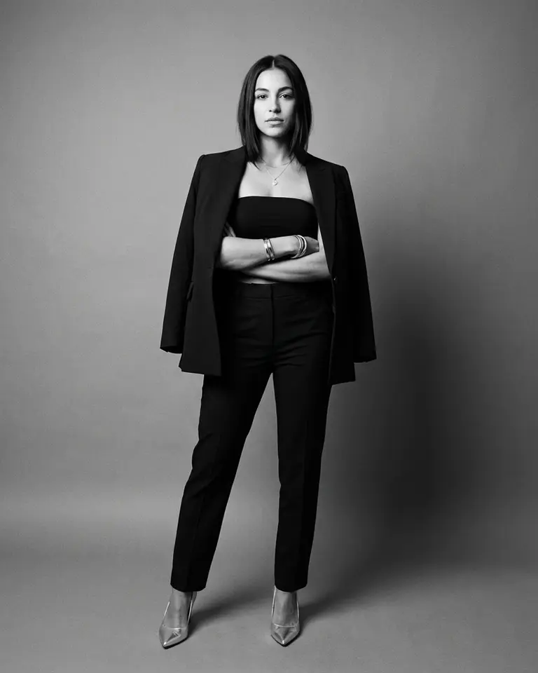
Great corporate headshots make your team easier to trust at first glance. The goal is consistency in quality, not uniformity in personality. This guide gives you a practical structure for style, wardrobe, and rollout so your leadership pages and team directory feel intentional.
- Define your baseline style before selecting photos. - Keep lighting and crop rules consistent across the team. - Let expression vary so each person still looks like themselves.